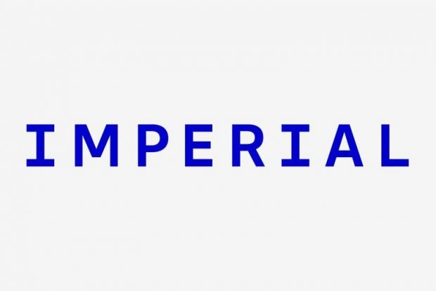
Imperial College London has faced criticism over a planned rebrand seen as emphasising “pejorative historical connotations”, with almost 3,000 people signing a petition against the new logo.
A spokesperson for the University and College Union (UCU) branch at Imperial said informal discussions with members had found universal disappointment at various aspects of the rebranding.
As part of the institution’s rebranding project, a new logo has been unveiled, stripping away most of its formal name to leave just “Imperial”.
“Several members are concerned with the pejorative historical connotations associated with this word, and do not believe it represents the global, forward-thinking image they believe the institution should be promoting,” the spokesperson told Times Higher Education.
UCU members had also expressed concern about potential issues of accessibility with the style of the new logo, particularly its typography and colour.
The spokesperson said there were also questions over the cost of the rebranding exercise, coming during a cost-of-living crisis when all three trade unions are in dispute with the college over pay.
“The consultation with staff on the rebrand…seems to have been pushed throughout without proper consideration of staff and student opinion,” they added.
A petition against the new logo has already collected more than 2,800 signatures within just a few days of launching.
“Many (if not most) students dislike the new logo; the new colour and font look almost cartoonish and it is not a good representation of the college,” it reads.
Those signing the petition have criticised the “ugly” logo for its “empire connotation” and the university for not – in their opinion – properly consulting with students and staff.
The removal of “London” from the logo – with the capital being a key selling point for the institution, particularly overseas – has also raised eyebrows.
Anaya Jaffer, a second-year mechanical engineering student who created the petition, told student newspaper Felix that she was not sure it was real at first.
“I was speaking to more and more people about it and realised that everyone shared this strong dislike,” she added.
Shengyang Zhuang, a master’s student at Imperial, told THE that he preferred the previous logo because it better represented the institution’s identity as a college – particularly overseas.
“If I am not in [the] UK, I won’t say I study at Imperial to people – I would say I study at Imperial College,” he added.
Although not a legal change of name as others have attempted, Imperial is the latest university to experiment in an area that often ends in controversy. In 2015, King’s College London was forced to backtrack on its mooted rebrand to “King’s London” after a petition.
An Imperial spokesperson said the rebrand would help the university to compete internationally.
“We have developed the brand identity with ideas and feedback from thousands of students, staff and alumni – testament to our community’s ambition, creativity, diversity and commitment to Imperial’s future,” they added.
“Importantly, we worked with a specialist agency to ensure the inclusivity and accessibility of this work.
“We have developed a visual and verbal identity, rooted in our science heritage, that is modern, confident and expressive, articulating Imperial’s purpose, vision, strengths and impact, and which differentiates us in a crowded and competitive landscape.”
Register to continue
Why register?
- Registration is free and only takes a moment
- Once registered, you can read 3 articles a month
- Sign up for our newsletter
Subscribe
Or subscribe for unlimited access to:
- Unlimited access to news, views, insights & reviews
- Digital editions
- Digital access to THE’s university and college rankings analysis
Already registered or a current subscriber? Login


